The Right Fabric Isn’t Always The Obvious Choice
Lazies, Sometimes it’s hard to know what a fabric will bring to your project until the work is done and all the players are in place. But then it’s too late to make a change. Let’s take a look at another auditioning technique to see how your fabric options might work in your final design.
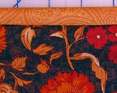
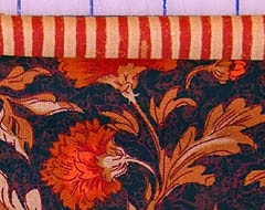
Floral and tan fabric to the left. Floral with striped fabric to the right.
Our Project: Miranda Day Bag
We are working once again with the Sketchbook line by Yolanda Fundora. Above, I’ve laid out the feature fabric for the body of the bag and I’m auditioning two fabrics for the faux binding/lining combo around the top edge of the bag.
Tan Fabric:
I like the warmth and calm that the tan brings to the black floral. Look how yummy that is. It is supporting and visually easy on the eye, making the black fabric stand out as the feature. The fabrics coordinate nicely. I love these two fabrics together.
Striped Fabric:
I love stripes. Visually dynamic. Emphasizes the red color in the floral pattern. But, I’m not sure who’s in charge here. The stripe is competing for my visual attention rather than supporting the black fabric the way the tan does. Stripe is not as warm as the tan fabric. It’s a bit of a challenge compared to the tan fabric.
Squint and Cover Test
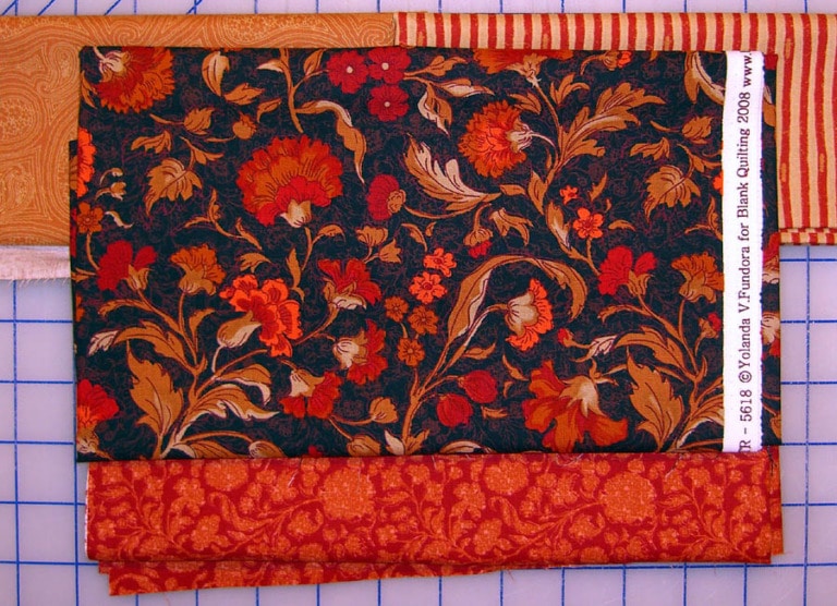
I’ve laid out the two test fabrics along with the floral fabric for the body of the bag and the red/orange fabric for the base of the bag. Stand back, hold out your hand like you are going to stop traffic and visually cover half the image and close one eye.
On The Move
Now move your hand back and forth to see only one fabric combo at a time and see which you like better. Both combinations work. Again the tan is softer and warmer. But now the red seems balanced in strength with the floral, supported by the red/orange fabric.
Stand Back and Squint!
Finally, stand back at least five feet from your computer and squint if you like – look how the tan fabric fades away. You can’t see the paisley print any longer. All you see is tan. It has no individual character other than color. The stripe, however, holds it’s own and somehow transforms into a delicate detail or accent from further away.
Final Choice:
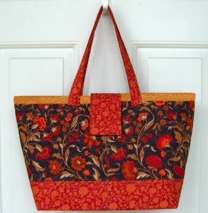
I chose the red striped fabric.
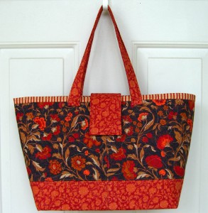
I’ve mocked-up an image showing the tan simply pasted on top of the finished bag. And it’s fine, it works, it’s lovely, it blends and coordinates. Below that is the finished bag using the striped fabric. The red stripe is dynamic and actually blends more that the tan based on pulling in the red/orange fabric at the base of the bag.
I think both combinations are lovely. However, I couldn’t visualize how each fabric might turn out on the bag until I put more of the picture together by laying them out and auditioning them. I could have gone further and put scraps in place for the handles and the flap closure.
Sometimes a little auditioning time is worth it when we see the final result. I walk through all of these techniques regularly as I plan and dream about projects. And time and time again, I let the fabric tell me who wants to come out and play. Apparently, I’m just the help.
Enjoy!
Joan
I love all your tips but this one is stupendous! It has helped me more than anything in a long time.
thank you sooo much and keep up the good work. I have almost all of your patterns.
sherry
I’ll vote for the stripe every time!
Laura
Yes we are the conduit that lets the fabric into the house! Lovely bag, I think I like the stripe and it all looks so fallish to me. Thanks for sharing.
Penny D in nasty rainy Chesapeake
What good advice– for quilts too. Stand back and audition fabrics.
Lori in Sunny Minnesnapolis!
I love the tan fabric with the large flowers. Stripes are great but for a different accent on a different fabric.
Great advice. I had not heard about standing back and squinting at it before. It really gives you a different perspective.
Your choice is the same as mine – the stripe. I always go for something contrasting in fabric design (stripes, dots, plaids etc., but in the same colorway so it “pops” allover. What a pretty bag you’ve made with the stripes. Gorgeous.
I would vote strip too. It makes it POP!
Stripes, stripes, always stripes. I use them whenever possible. I love how it makes the bag pop!!! Thanks for all the great advice!
The stripe fabric also coordinates better with the fabric used at the bottom of the bag. So the top and bottom frame the focus fabric better.
It pays to look it over carefully. I had picked the tan but when I saw the finished Miranda, it is evident that the stripes look better. More pizazz. Funny how that works.
Nice post – thanks for sharing the method.
I like the stripe, too!
One thing I find myself doing in my favorite quilt store (where I can’t stand far back from the bolts of fabric because of limited space) is taking off my eyeglasses to view the colors together. Because I am very nearsighted, I find that it just “blurs” the bolts of fabrics into colors sort of like standing far away would.
I tried that just now with the computer instead of squinting, and it worked! The stripe was the hands-down winner.
The stripes definitely win! Great advice. People have asked how I choose my fabric and all I can say is trial and error. Often I start with one thing and end up with something totally different. Sometimes it takes me an hour to choose fabric for one bag.
I think what makes your bags so great is your wonderful sense of color…..
I DO think you get better at co-ordinating fabrics. Sometimes you just have to pull one away from the choices and put a new piece into the mix. And sometimes it’s a fabric you wouldn’t think would work and it DOES! I get hung up on tones alot. It’s just a little too teal or a little to peachy. Thank goodness for our stashes, huh??? ~kath
Joan I am so happy,I agreed with your choice. But only after i did the squinty parts.
Thank you for another lesson. Ellen
I loved the bag with the tan, however, the stripe really did it. I will start auditioning and won’t play it safe anymore. Thanks so much!
This is a fantastic tip! I have been quilting for quite awhile and this technique is so useful….now my projects will have the ooph they deserve!
In the audition pictures, I was definitely for the stripes, but once I saw the final bags, I actually like the tan better. I think there’s more contrast with the tan and it really brings out the top line of the bag.
Go figure…
I had picked the strip right from the start. The other fabric was just “lost” against the print. I guess the steps are nice if you need them, but for me it was a no brainer
Instead of just squinting, use a peephole…only a couple of dollars at the home improvement store.
This is one I am printing and posting in front of my work area. I ponder to long over what combinations would work for a project.
Thank you for this helpful advise.
Bonita
Great advice! I posted a link to your article on Craft Gossip Sewing Blog:
http://sewing.craftgossip.com/choosing-the-right-fabrics/2009/04/08/
(Link will be active April 8, 4:30 PM CST)
Pingback: Choosing the right fabrics · Sewing @ CraftGossip
Hi Joan!
I love this tip because it’s exactly what I do with my “crazy quilts”. I never know exactly what fabric is *perfect* for sashing my quilt squares together so instead of choosing the sashing fabric right at the start of the quilt, I often wait until all my crazy cut squares are made, then I take them to the quilt shop with me and “audition” all kinds of fabrics 🙂
Thanks always for your great tips, Marguerita
Yes, the stripe looks very dynamic; totally pops. I never would have thought to put that combination together, but it definitely works. This was a very useful tip and I’ll be “auditioning” my fabrics now from a totally different perspective. Thanks Joan!
Pingback: Crafting Around the Web : Blisstree - Family, Health, Home and Lifestyles
I am so blind w/o my glasses so I just take them off to help “audition” the fabrics! Old nearsighted self enjoys looking at lit Christmas trees w/o my glasses too! My own Monet!
Another great way to help decide what fabrics go together is to take a digital photo then look at the pictures. They look quite diff. than what my eye sees