Tutorial: Choosing Fabrics to Accent a Bag Design
Lazies, When looking for fabrics to dress my bag designs, I focus on fabrics that will work together as well as compliment the design features of the bag. Sometimes I draw fabrics together from all corners of my stash, other times I find what I need in one fabric collection. I think this ‘Lilliana’ line is perfect for my bag designs because of its combination of colors, prints and scale.
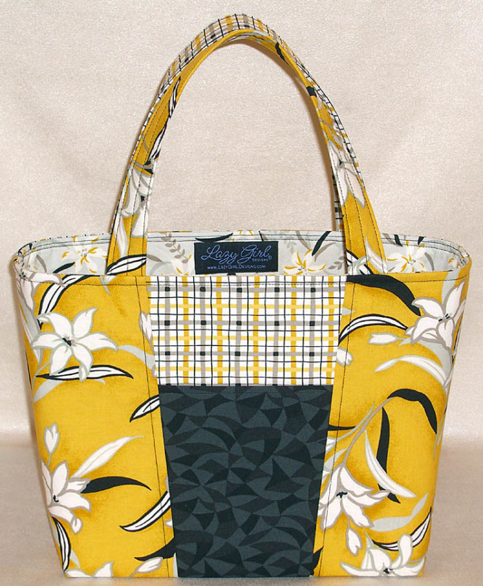
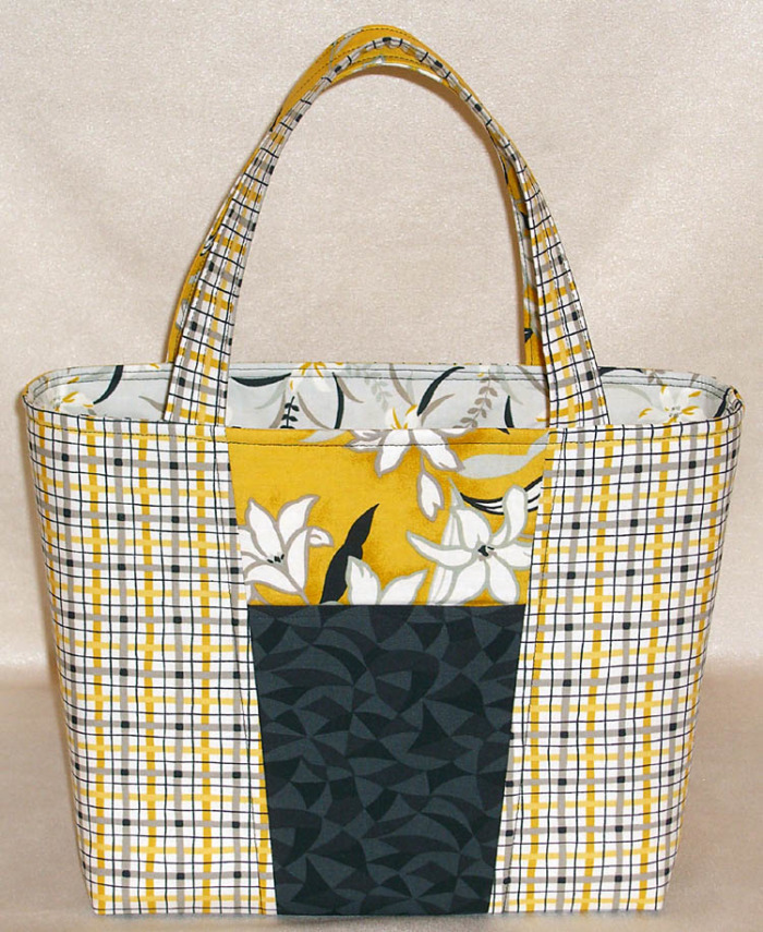
Claire Handbag (LGD125) dressed in ‘Lilliana’ by Gail Kessler for Andover Fabrics.
Scale
The main gold fabric has a medium scale flower. As it’s used on this bag, the size of the flower is large enough that we can’t see the whole pattern, but small enough to give you an idea of the flower/stem/leaves. We know what the design is, but we want to see the rest of it. The partial flowers invite your eye around the bag. The medium flower is a vastly different scale than the smaller plaid. Where the two fabric abut creates interest due in part to the difference in the scale.
Next, we have a smaller scale flower for the lining. The two fabrics compliment each other nicely. The light gray of the lining is a crisp and cheery invitation to the inside of the bag. The plaid? Well, what can I say – I’m in love. The plaid, set on a white background, is a smaller scale than both florals. It incorporates the colors of the lining and cover.
Color
We have four colors working together in this fabric collection: black, gray, white, yellow. Three of the main fabrics used in this project have all four colors in them, but each uses a different color for the background. Each of the main fabrics is anchored in a different color. The plaid has a white background. The medium floral is yellow and the lining is gray. Imagine how different the project would look if the lining had a yellow background. The lining of the bag would be lost against the yellow and white fabrics from the cover. Our eye would roll from the outside to the inside with a murky transition, rather than a crisp one.
Accent Color
Black is our accent color, anchoring the entire project. Without the black, the bag might seem ‘light’. Go ahead and cover the black with your hand and see what you think. Adding the black pocket front and center visually pulls the bits of black together in the other fabrics.
Defining the Design
Using fabrics that compliment and contrast help to strengthen the design lines of the bag. The angled seams of the center panel are easy to distinguish because of the fabrics used. Locating the top of the pocket is easy because the black is in stark contrast to the fabric underneath it. The handles flow smoothly from the top edge of the bag because we used the same fabric where it connects to the bag.
‘Freebird’ Fabric on the Claire Handbag
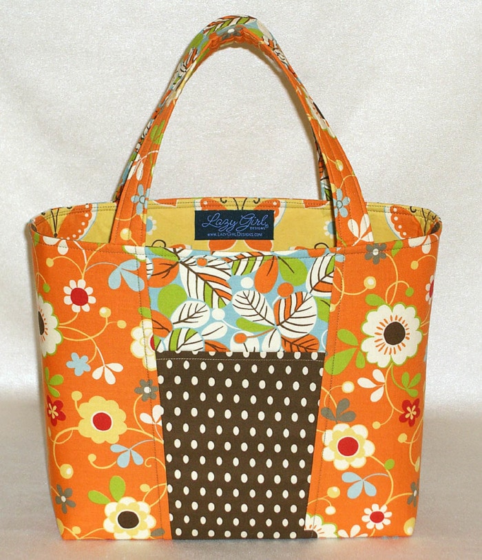
This scrumptious orange and brown cutie is a Claire Handbag all dressed up in ‘Freebird’ by MoMo from Moda. My goodness, every piece of this collection warrants drooling.
Remember, on Claire, the front and back play the ole’ switcheroo with the two main fabrics so the back view is different. And the inside is a feast of fabrics. I love the orange/brown/green mix and including the cool, crisp blue is a snappy addition to this palette.
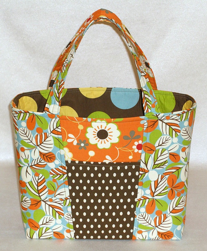
Back and inside views of ‘Freebird’ Claire Handbag.
‘Metro Mirage’ Fabric on the Miranda Day Bag
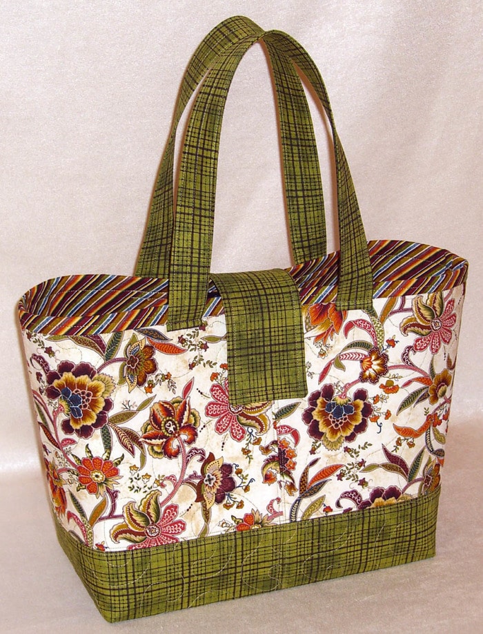
Next up is a Miranda Day Bag all dolled up in ‘Metro Mirage’ from Marcus Fabrics. It’s a beautiful festival of fall colors centered around the Jacobean style print on the light background.
Optical Delusion
Not that it matters a lick, but when I was putting this beauty together, I thought of it as a white bag due to the main print. However, the green plaid at the bottom of the bag makes it feel like a green bag. Early on in my quilting adventures, it was explained to me that what ever color I choose for the inner border around the main part of a quilt is probably the ‘color’ I’d think of the quilt as being. In other words, it’s a defining element. That same thinking seems to apply here with the placement of green. Although there is more of the main print, the green defines the bag for me. What about you? Do you think of it as white or green?
Here’s an inside view. I used the feature fabric for the Bag-E-Bottom sleeve to tie the inside and outside together. Aren’t those diagonal stripes fun? And the warmth of the pocket fabric makes me want to go play in a pile of leaves. I guess I’ve got Fall Fever.
Subscribe to receive emails for my blog and newsletters about new patterns and project ideas.
Enjoy!
Joan
Joan’s Sewing Group | Pinterest | Instagram | Twitter
Like and share this post with your stitchy friends.



What do you use for “filler/batting” to make your bags look so stiff and hold up so well?
Hi Sheryl, From Pellon, I like Decor Bond fusible interfacing item # 809 and Fusible Fleece for batting item # 987F. From Bosal (bah-zle), I like their Fusible Batting item #325 and Fusible All Purpose Non Woven Interfacing, item # 334. Joan
Perfect fabric for that bag. I like how it keeps the eye focused. You’re not looking every which way!
you are a champion at the color selection
The lining of my handbags are never smooth and taught inside like the beautiful bag that was displayed on your website dated February 8, 2010. ( The handbag with the georeous combination of yellow and black fabrics) The interior fabric is smooth and tight and the interior seams seem to be aligned with the exterior seams. My exterior and interior side seams match nicely at the top because I stitch around the top perimeter of the bag but the rest looks messy sometimes. Please help and share some hints with me!! Thanks, Carol
I’m with Carol, ’cause my bags come out loose on the inside too. Can anyone give us a tip on how to avoid that problem? Joan’s bags always come out looking taut on the inside, so together. I want that for my bags too.
How do I get this pattern ?
where can your patterns be purchased
Do you machine stitch the bags button on all the way through the fusible velcro?