Cleavage as Inspiration: The Story of our Candice Bag
Lazies, Sometimes inspiration can be right under your nose…literally. In the movies and on TV, we’re led to believe that the safest place to tuck something from time to time is down our shirt. So what better inspiration for a safe purse pocket than the age old wisdom of cleavage.
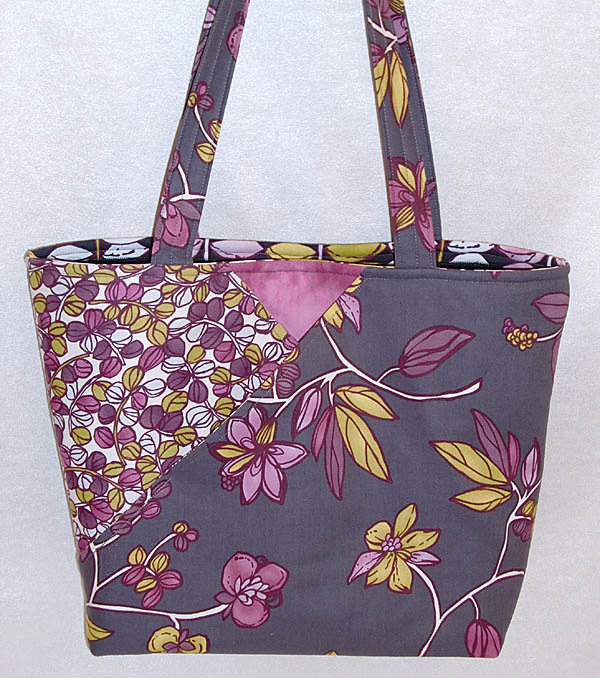
The inspiration for the Candice bag was a favorite blouse with a surplice front, where left and right sides overlap to create a ‘V’ neck with just the right amount of puffiness and cleavage. Meet Carmen, the prototype for our Candice bag.
This is not a new design and is not a pattern. It’s simply a mock-up that led me to Candice.
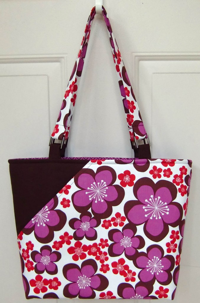
The floral with the white background is one pocket. The floral with the gray is another pocket. So, we have two front, overlapping pockets, with angled entries, creating a visual centerpiece at the ‘neckline’.
Front Pockets
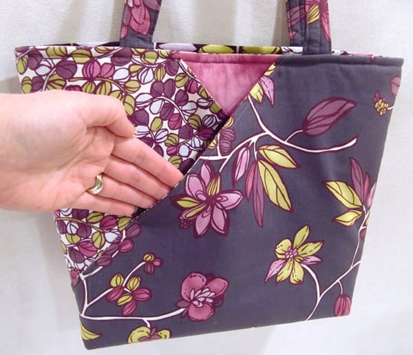
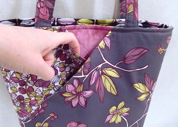
Let’s take a look at the function. The gray fabric is a lined panel, stitched in place just below my hand. That makes a pocket approximately 4″ deep for the width of the bag.
Next up, the second panel is also a pocket. The pinky-purple triangle area you see is the actual front of the bag, which also offered an opportunity for a contrast fabric to highlight the pocket cleavage. In my mock-up, I had planned the cleavage to be wider, being open for the whole width between the handles at the top edge of the bag for easier access. However, I ran into a logistical/design issue. Moving the pocket panels apart for a bigger ‘V’ means the gray pocket comes close to hitting the front bottom corner of the bag and that’s a look I didn’t like.
Aside from all of that, the pockets did work. I envisioned this design being a purse on steroids. I wanted it to accommodate stuff for errands like coupons, mail, the checkbook. I wanted safety and style. And I was darned intrigued by trying to translate blouse cleavage into a clever purse. The story continues…
Inside Pockets
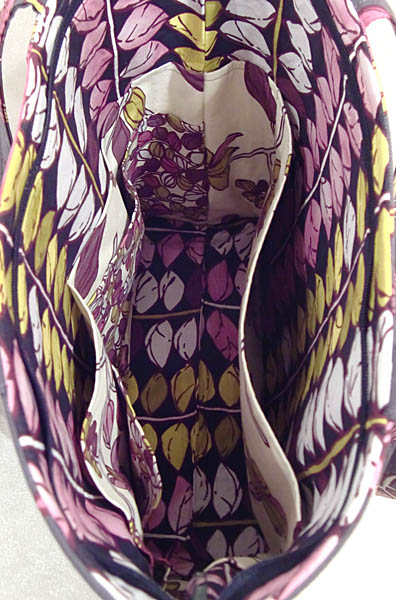
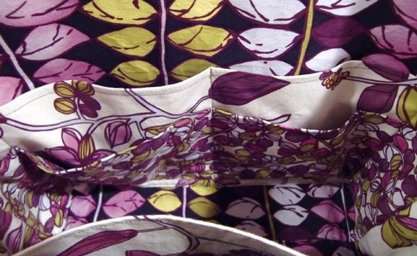
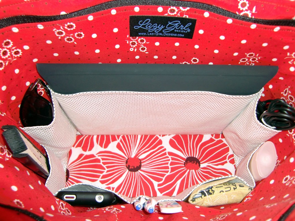
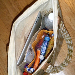
I wanted more pockets with more variety of sizes for the lining. Here I added two layers of pockets to the left lining and one to the right. I hoped it would be the business wall of the bag. Envelopes, checkbook, notepad. Pens, phone, etc. And one big pocket for my iPad or other tablet.
Here’s a better view of the wall with double pockets.
Testing the Design
Well, I finished Carmen and it was time for testing. I loaded her up and we went for a test. She held everything. She functioned. She was complete. But I didn’t like her. I really didn’t like her. Margo preceded her, so she had a high bar to pass. Quite simply, Carmen did not pass my test for being a fabulous bag. It went so badly that we didn’t speak for some time.
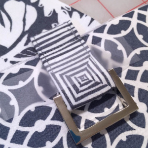
I made this Carmen prototype in September 2010. Our test drive was so bad that we weren’t on speaking terms for nearly a year. I shelved her until the following August when we started to revisit the cleavage and double wall of pockets. Carmen became Candice and we uncovered one of her shoulders for a more flattering and functional pocket design. I love the front pocket – more about that in a future post. We said goodbye to the notion that a double wall of pockets was twice as good as a single. I added metal rings to the handles – ‘earrings’ as they relate to shoulder and neckline as we’ve been discussing.
I created the ‘fat pockets’ design to accommodate a tablet or e-reader. And suddenly, Candice was singing to me and I knew she was done. Below is the first Candice and I asked my sweet friend Karen to test drive her for me. Karen gave Candice rave reviews and I don’t believe I’ve seen the bag since.
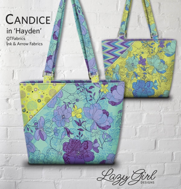
Meet Candice
Hop over to this blog post to get to know Candice better. Coming Soon: Meet Candice
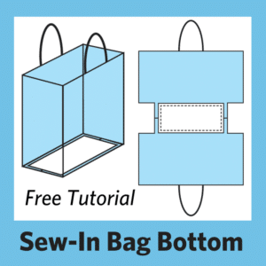
Extra – Use our sew-in bag bottom tutorial to add a bag support to Candice.
Sometimes a design sings to me right away and we are best friends from the very start. Other times, like with Candice, the love needs to grow.
Enjoy!
Joan

I love my Candice… I am using the large e-reader pocket right now for all the Christmas ad and store coupons I carry during the season…. Great place for them.
I guess I need this pattern for my sister’s Christmas gift!!! Will order it through my local quilt shop. Thanks for this fun blog.
I made Candice this summer out of batiks and actually get comments on it a lot!! (I never thought I would be showing people the inside of my purse!) My mother in law saw it and said “I want it”. I said “you can’t have it”. So I am making her one for Christmas.
What an awesome idea! You are always so creative!
I’ve made 4 of these bags now! One for myself, one for my mother and actually two for my BFF! Most recently one for her with guitar fabric that she loves!
I am planning on making these for every season, holiday, whatever comes along! I have 3 bins of fabric and plenty of interfacing so I’m ready!
Thanks for a great GREAT design!
Love the double inside pockets!
Wow, that is awesome. Love the colors too.
Great job,
Susie
You know I love my Candice purse and your instructions are EXCELLENT! I really like the idea of the other pocket on the outside…I guess I’ll need to make another on
Kelly
Heck Yeah!! This is exactly what I have been looking for! Thanks!
I loved reading about the creative process in developing this great bag
Love the bag….is anyones’s purse really that organized? LOL
No one hs said anything about the ease (or not) of making it. Since I have been a beginning sewer since the 19 hundreds, you can understand why I’m asking the question. I LOVE the look and design of the purse, but could I actually make it? That’s the big question.
I like the looks of it, but does it have a zipper closure? I really have problems with a purse that is just snapped or buttoned, because when it tips over, ev erything falls out! Anyone else have that problem?
I love this bag. I made 7 of these bags for my daughter to give to her bridesmaids as gifts. We filled them with all of the essentials needed by a bridesmaid at a wedding. Lotions, tylenol, Chapstick, mirror, comb, brush, you get the idea. Since the wedding each one of the girls has contacted me and asked if I would make them another bag. They love them! The instructions were extremely simple and crystal clear. i have since made one for myself and use it as a laptop bag for work. We have smaller laptops (Toshiba Portege R930) and the laptop fits in the center of the bag perfectly along with a notepad. The pockets hold my mouse, power cord, pens, pencils, usb cords, iPhone, charger, and earbuds. I throw my sunglasses and keys in the front pocket and now I only need to carry one bag to work instead of a laptop bag and a purse! I love it!
What a fun story – but love the look of Carmen; can’t believe she failed the test.
Love the fabrics, too. I just made a few “Whimsy”s for gifts (after enjoying my own for a few months), and thought of adding some inner pockets to that bag – have you tried it?
I just saw the Candice bag on Facebook. What a clever idea for the hidden cleavage pocket on the bag.
Love the design of the cleavage bag.
I am having a difficult time with this pattern because all the prototypes I see look to me like they have 5 different fabrics (Different one side then the other) however the pattern calls only for 4 fabrics. I am new to sewing so I confuse easily.
Hi Cheryl, The Candice does call for four fabrics. You can certainly use more if you choose. Follow the pattern as it is written and it will guide you through where to use each of the four fabrics.